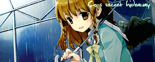
welcome to my hideaway
fact file:
started around mid october of 2010, wasn't too serious, started making an effort in late december, started just making icons, but lately been trying sigs and banners, i use photoshop (CS4) and gimp, loved both of the programs. love the features of both. recently, i been trying to do some of the effect using picnik as well.
rules & guidelines:
- all forum rules applies
- no spamming
- no trolling
- always try to cnc
updates:
- will update probably weekly if i'm not too busy
- will check daily, so if you post, i will reply
- check last page for all new updates
cnc:
- please specify examples and avoid general comments
- techniques help is wanted
- guidelines or any good guide would be helpful for me to improve
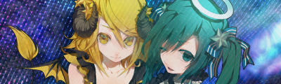
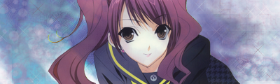
tag examples (most current):
tags:


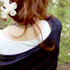
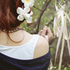
most current.
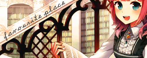

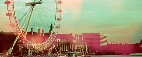
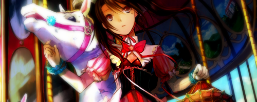
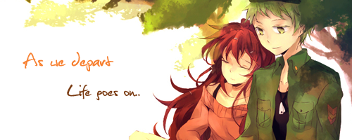
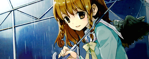

most current.
EDIT: to check out icon galleries, please scroll down to the next post
Disclaimer
I do not hold any copyrights to the images used to create my tag, icons, sigs etc. All of the finished products are made by me. Do not steal, copy or take without permission, please respect the hard works and time and effort put in for all of the product. Copyrighted/Credits goes back to the rightful owner of any images, programs, and finished product.


") I really really really heart those icons of yours, they are beautifullll!!!! :3 Though they look a bit plain in my eyes... Maybe some more textures? Could I bother you for the original image too? >< For the avys I like them, they're very nice.
I really really really heart those icons of yours, they are beautifullll!!!! :3 Though they look a bit plain in my eyes... Maybe some more textures? Could I bother you for the original image too? >< For the avys I like them, they're very nice.