GFXer's Corner
- Thread starter Hadriel
- Start date

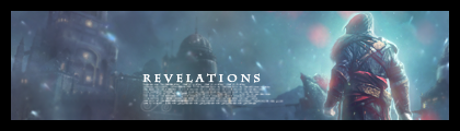
[MENTION=2]Emeralda[/MENTION]: Thx for the CnC, I'll try to apply what you suggested the next time I get on a computer.... Which is goig to be a while. >_> But about the clipping masks.... I'm a bit confused, I know how to do them but not sure what you meant to clip. Because the sig was made from various stocks from zerochan set to different settings and I erased parts I didn't like. That was all I did to the sig besides adding text and gradient maps...
---
@Lulu: I'll CnC, sorry if it sucks. ><' It's really cool how you made the textures yourself! They look really nice, the sig is pretty and simple. Only main comment is the brokeh texture(?) near the bottom right corner, it's a bit bright had sometimes takes my attention away. But in a way it kinda looks like the brightness is what your focal is staring at, which is really cool. So if that's what u were going at then good job!
//endsbadcnc
Thx for the CnC, I'll try to apply what you suggested the next time I get on a computer.... Which is goig to be a while. >_> But about the clipping masks.... I'm a bit confused, I know how to do them but not sure what you meant to clip. Because the sig was made from various stocks from zerochan set to different settings and I erased parts I didn't like. That was all I did to the sig besides adding text and gradient maps...
Lulu: Nice background, nice render, but nothing else, really. It's a nice and simple sig. You could try adding some brushes or something above the render layer here: http://prntscr.com/238cl Also a border is a must so it would have a sig like feel to it.
@Lulu: I'll CnC, sorry if it sucks. ><' It's really cool how you made the textures yourself! They look really nice, the sig is pretty and simple. Only main comment is the brokeh texture(?) near the bottom right corner, it's a bit bright had sometimes takes my attention away. But in a way it kinda looks like the brightness is what your focal is staring at, which is really cool. So if that's what u were going at then good job!
//endsbadcnc
//endsbadcnc
Do one more blur round for background. Get rid of the ugly text that was place there randomly, it completely doesn't fit. The lightning is also horrid, you have a really lightened render, where you see there should be a strong source of light, but the background is almost night-light. Also this: http://prntscr.com/235oj < the legs, even though the effect should be that they are in water, stick too much out, creating a weird effect.
Can you give me the psd? Maybe I can fix it a bit, and tell you what I did to it. I haven't Photoshopped stuff in a while.
thanks for the tips but I think I will just leave it like that.
50% cause I like it and the other 50% cause well..someone said its nice. Its more than satisfactory for me....:grin:
Hello all of you, i'm a newby here, and i've got some questions about signature :
1 => how can i do to set it on the right or in the middle of the space ??
2 => when i upload my image, it doesn't come in my signature preview oO, is that normal ??
Thanks for your answers, and btw i've seen some link to deviantart ^^ so here is mine if you'are dropping an eye on sometime
( please forgive my english i'm french... )
Have a nice day
1 => how can i do to set it on the right or in the middle of the space ??
2 => when i upload my image, it doesn't come in my signature preview oO, is that normal ??
2 => when i upload my image, it doesn't come in my signature preview oO, is that normal ??
2) You shouldn't upload your sig image to this site itself. It decreases the quality. Try hosting the image beforehand on a site like Imageshack or Tinypic, then, when you want to add the image, press the button which looks like a yellow rectangle with mountains and a sun, and enter the URL of the image in the box that appears.
Its just this part that confuses me. What exactly am I supposed to be clipping?
---
[MENTION=2]Emeralda[/MENTION]
---
[MENTION=2]Emeralda[/MENTION]
http://www.elated.com/articles/creating-and-using-photoshops-clipping-masks/
A Clipping mask is a photoshop technique
http://www.elated.com/articles/creating-and-using-photoshops-clipping-masks/
http://www.elated.com/articles/creating-and-using-photoshops-clipping-masks/
sorry double post
[SPOILERA]http://c-h-i-m-e-r.deviantart.com/[/SPOILERA]
I don't know if i can post direct link so i spoiled it ^^ but i'm sure of how the spoil work... sorry if i missed
[SPOILERA]http://c-h-i-m-e-r.deviantart.com/[/SPOILERA]
I don't know if i can post direct link so i spoiled it ^^ but i'm sure of how the spoil work... sorry if i missed
Thanks for the tut, :3 but I was asking what she wanted me to clip. I know how to do it, but it confused me when she was talking about the typo the jumped to clipping in the same sentence. So I was confused as to what to clip.
I wasn't sure if you did or not, cause everyone does different things with ps, I know people who have never used clipping masks before. So when I read your thing, I thought you didn't realize what she meant by clipping mask, my bad >_<"
@ Chimer - I took a brief look around your deviantart and I like your designs, they are pretty tight. My only problem is when you try to blend them with the colors, I'm not sure what settings you are using (Overlay, Linear Dodge, etc..), but its creating a weird (Terrible way to describe it) vibe, that the colors just seem unnatural/unfitting. The choices of colors themselves are great, which is why I think its just the blending settings that are screwing you up.
I don't know if i can post direct link so i spoiled it ^^ but i'm sure of how the spoil work... sorry if i missed
Anyway, I totally love this one:
[SPOILERA]
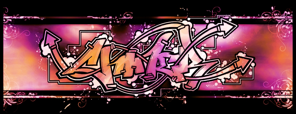
I haven't seen anyone making graffiti like stuff yet, so it seems really refreshing.
Lol, sorry xD
I wasn't sure if you did or not, cause everyone does different things with ps, I know people who have never used clipping masks before. So when I read your thing, I thought you didn't realize what she meant by clipping mask, my bad >_<"
I wasn't sure if you did or not, cause everyone does different things with ps, I know people who have never used clipping masks before. So when I read your thing, I thought you didn't realize what she meant by clipping mask, my bad >_<"