SOTW #3 - Voting

Status
Not open for further replies.
#1
This time, we have 3 entries! Thank you, entrants!


Here are the entries. Make sure you take a look at the voting rules before voting!


Theme:

Easter


Entry #1


Stock: http://img.wallpaperstock.net:81/cross-and-grave-wallpapers_920_1600x1200.jpg


Entry #2
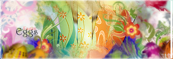


Entry #3


Happy Easter, folks!


NOTE: There is a new rule


If you have won the previous SOTW, you can enter the current one, but if your entry gets the most votes, the winner will be the entry in second place. However, your status as the entrant who got the most votes will be highlighted.


~Kitty~

Kitty pawns all!
#2
Entry 1 seems like only the background changed color...


Entry 2...it looks fantastic....but. wheres the easter egg? they are blurred to the point that one cant recognize them at 1st glance..


So i guess Entry 3 GMV....but could do with better text
 

Crestham

~*†Tank†*~
#4
Entry #1 is probably about the origins of Easter. However I don't think it's suitable as a siggy.

Entry #2 is kinda messy. I can't tell what the focal is, but I do see some blurred eggs at the sides.

Entry #3 looks good, but the text could be of a different colour. Also, I like what you did with the depth.


Entry #3 GMV.
 

VivaLaDementia

Yea, Its been a ride...
#5
[quote name='Hadriel']For me, Entry #2 wins, hands down. It's on a whole different level than the other two. It's awesome.[/QUOTE]


Same for me, Entry #2 GMV


BTW - Is there any point for showing the stock for the first image? Just curious~
 
#6
[quote name='VivaLaDementia']

BTW - Is there any point for showing the stock for the first image? Just curious~[/QUOTE]


I've explained it in the SOTW #4 thread.
 

Crestham

~*†Tank†*~
#9
[quote name='Johnzy']Entry #2 gmv~

It's time for Emmie to win! xD
[/QUOTE]


DERP

It's not my position to say this, but you just broke a rule
 

Maria.

→Donut Vampire
#13
#1 GMV.

-It really relates to the theme really well. The feel and atmosphere is well done.

It's a splendid execution.


Though I do agree that #2 is the most appealing but it doesn't REALLY make any sense to me. It's Easter eggs yet the eggs are barely noticeable.

Be aware that the theme is easter so you may want to make it more Easter-like by making the eggs more noticeable. When I saw #2, I was: "Oooh this one is pretty but wait. >_< where in the hell are the eggs? OTL"-type of thing.


#3 is appealing but I have to admit(and be rude). That it is the most off from the theme.


This is why I despise themes like this one. <_<

All you have to do is find the most visually appealing and POOF it's your vote. OTL

For some people this theme just requires your piece to be pretty but for me, NO. :/


If you still don't feel like getting the point of Lady Maria on this theme then please stay on making conceptual themed and technical tags than eventual/seasonal themed tags.


-Maria.


P.S. The essence of SOTW- It is to show how a GFXer can execute a selected theme. It is a "tag" in general but it doesn't mean that you have to take into consideration if that tag can be worn. Tags and signatures are technically the same but digging more into it. Signatures are generally tags and tags are generally art pieces. In short, when you say tag it doesn't mean that it must be a signature that can be worn. Rather, an art piece.

I again is appalled for the people who doesn't even take into consideration the very meaning of what you call a "tag."
 
#14
Entry 3 gets my vote.


Entry 1 fits the theme but... its not really something you'd have for a signature. Also the text is distorted.

Entry 2 looks great but I can't see the render or what the main part of the sig is. If its just designs from an easter egg well..... :/

Also the white line before the border is a bit larger on the right end.

Entry 3 has relevance to the theme (rabbit ears >___>) and its what I'd call an amateur signature. I say amateur because the text is .... unappealing to say the least. Also the render and the BG don't transition too well. But I'd say this would actually fit the theme above the other two
 
#16
Entry #2 I guess....

Reason: Basically like what was stated before.

the first one, nothing much was changed besides the color, the text is a bit distorted too, but it's appealing..

the second, the focal, to me, is unclear, but compared to the other 2 it wins...

the third doesn't fit the theme much for me, and seems to be missing something?
 
Status
Not open for further replies.