Thanks for your enthusiasm, entrants! In our inaugural SOTW, we've managed to get 11 entries! You guys rock!
Here are the entries. Make sure you take a look at the voting rules before voting!
Theme:
Freestyle
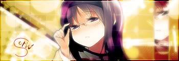
Entry #1:

Entry #2:

Entry #3:

Entry #4:

Entry #5:

Entry #6:

Entry #7:

Entry #8:
Entry #9:

Entry #10:

Entry #11:

(If your entry isn't here, please PM me ASAP!)
Here are the entries. Make sure you take a look at the voting rules before voting!
Theme:
Freestyle
Entry #1:
Entry #2:
Entry #3:
Entry #4:
Entry #5:
Entry #6:
Entry #7:
Entry #8:
Entry #9:
Entry #10:
Entry #11:
(If your entry isn't here, please PM me ASAP!)
") Don't get me wrong the other entries are really good too, but 2 and 10 just seems the best with how there isn't too much negative space, good placement, and typo.
Don't get me wrong the other entries are really good too, but 2 and 10 just seems the best with how there isn't too much negative space, good placement, and typo.