SOTW #2: Voting

Status
Not open for further replies.
#1
Thank you for your entries, folks! This time, we've got 6 entries, and they are great!


Here are the entries. Make sure you take a look at the voting rules before voting!


Theme:

Depth


Entry #1


Entry #2


Entry #3


Entry #4
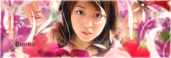


Entry #5


Entry #6


~Kitty~

Kitty pawns all!
#2
3 very obvious entries XD


i guess i vote entry 2 huh....clearly the depth is there


entry 3....yeah keep shuffling


entry 5 has depth. but i think the main character should be the focal not that chain >.<


entry 6 hmm i get the feel but number 2 has more


Entry 3 GMV....i feel like theres more depth now that i compare the both of them
 

Lovely.

Hiatus-Land
#3
My vote goes to entry #2 For me, out of all the other entries, it seems the most realistic and most 3D... The bright light by her hair is a tad distracting, but still, it seems to have the most depth.:)
 
#5
My vote goes to #4. It's cute and nice.


Entry #1 is not bad, but the bluespam hurts my eyes.

Entry #2 is also nice, but it feels oversharpened or something in some places, unless that was the feeling you were trying to achieve.

Entry #3 looks a bit sketchy. I dunno how to describe it, but it seems shoddy.

Entry #5 is good, but nothing special unfortunately.

Entry #6 really could do with a typo.
 

Emeralda

Pistis Sophia
#6
#3 gets my vote. It has an excellent display of what depth is, although the potential of the text wasn't fully utilized. If it wasn't so high even I wouldn't mind having such a sig.


2, well:


[quote name='Hadriel']Entry #2 is also nice, but it feels oversharpened or something in some places, unless that was the feeling you were trying to achieve.[/quote]


6 had huge potential, but it looks like an unfinished product. There should have been more careful blur/sharpen action, some nice lights, border and ofcourse, a text.


#1 I'm watching you and I know what you did.


#5 I refuse to comment on any vertical tags.
 
#8
3, 4 & 6, I like them but number 3 will get my vote, the composition of the whole is just great.


Number 4 looks like the girl is looking from a narrow window, nice, but I prefer the other set >.>


Number six, if only there were border.
 
#9
#2 GMV. It's true that in some parts it's oversharpened, but this tag has more depth than the others. The lighting was also too bright in the top left, but it also made the tag look more interesting, daring and bolder than the others.
 

Sanae

Active Member
Staff member
#10
Entry #2 also has my vote ^__^


Not really sure what depth was at first, but reading the description, it seems to fit the bill and it's also eye catching ^__^
 

Maria.

→Donut Vampire
#11
To be honest, almost all the entries failed to execute the theme except for #3.

So #3 GMV for doing a good execution of the theme.


I would vote for #2 because of all tags it is the most appealing but honestly speaking, I don't see much depth in this tag. I see a depth and that is the difference in the scaling of the two renders(?). But it's barely recognizable as depth.


#3 GMV.


P.S. I really feel almost all people here is misunderstanding what depth is. <_<


P.P.S. tsk tsk tsk. People, commoners and the like. If you view depth as blurring, then you fail, my dear.
 

Jimzy

Active Member
#14
Nice works again! 8D


Let us see.

#1= Cool. I like blue and this really caught my eyes. I dunno Depth but I'm guessing that you used it on the scales of the monster - which is amusing. I like how you did the sig as a whole except the lightning. I would like to see a normal lightning here with matching application of depth. I bet it'll look neater and much more attractive? Cause seriously, like Haddy said, Blue Spamming looks very odd in this entry~

#2= Awesome. The Madoka Depth is clearly associated? (Is that the proper term?) I like how you applied depth to Madoka's character as well as to the sakura petals floating in the air. Really nice and great~

#3= Wow. I like this one cause for me, it's the most realistic. The usage of the stocks were well organized. The focal point is clear and the depth used to it made it more attractive and realistic. Thumbs Up~

#4= Bimbo is Emmie. :/ I like it. The theme is well executed here. But the fact that there are those tiny puzzles of face parts, makes me believe that the theme here is mirror? Or something like that~

#5= Nice. 'Wonder' . Improve it. Maybe use other color? Chain. Remove it. Or change it? Maybe black sakura petals as I view the character to be Sakura? Good~

#6= Pretty. Depth is 'overused'. Maybe use depth only on the background? I can see what it'll look like. Or maybe use it on the flowers in the front and sharpen the character. Again, I can see how it will look like~


My vote goes to Entry #1~

It's really great for me.


Second must be the third entry.

Third is tie = #2 and #4

Fourth is a tie again = #5 and #6
 

Crestham

~*†Tank†*~
#15
Entry No 2 and Entry No 3 appealed to me at first sight.

...it's so hard to vote because I can tell who made what >_>

Self-bashing lol

I guess my vote goes to Entry #3 because the theme was clearly apparent in this entry. In Entry #2, it took some time for me to see the depth in it.
 

Bố

Active Member
#16
[quote name='Hadriel']
Thank you for your entries, folks! This time, we've got 6 entries, and they are great!


Here are the entries. Make sure you take a look at the voting rules before voting!


Theme:

Depth


Entry #1


Entry #2


Entry #3


Entry #4


Entry #5


Entry #6


[/QUOTE]


Hard choice between #3 and #4.

#3 GMV because depth was more clearly expressed in this entry.

#4 comes to a close.

Others..........no cookie for you.

 
Status
Not open for further replies.